
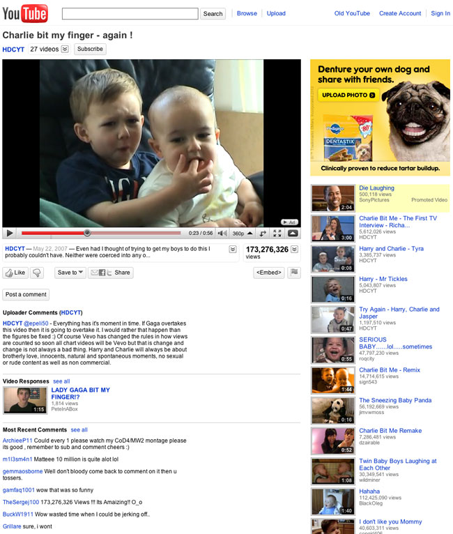
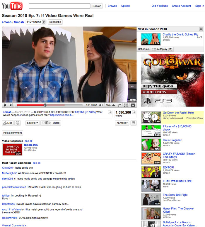
After months of planning and testing, the Internet’s No. 1 video-sharing site, YouTube, launched a new look and received mixed reviews.
The redesign eliminates one of the chief irritants to tubesters: clutter.
“We heard from users that there are a lot of unnecessary features and clutter that could be cleaned up,” YouTube spokesperson Chris Dale told TechNewsWorld.
“Video is the center of our universe, and it’s the center of the user’s universe, and that is much clearer in this redesign than it has been in the past,” he maintained. “We’re bringing everything back to centering on the video experience and how the users are engaging in that video.”
To avert clutter, the redesign groups all the information about a video in one place, and its detail can be obtained in a consistent way.
The action bar on a video’s page has also been cleaned up, and the presentation of controls for sharing, flagging and embedding videos streamlined.
Smarter Discovery
In addition to curbing clutter, the redesign seeks to improve a videophile’s ability to find clips of interest. The service’s suggestions on what to watch next is “smarter” and based on how a video currently being watched was discovered in the first place.
“I think the redesign is an improvement,” Coree Silvera, a YouTube user and founder of Market Like a Chick, told TechNewsWorld.
“I especially like the hover features,” she continued. “It’s such a pain when you want to look at a video, and you’re not sure if it’s exactly the right one, and you switch to the page, and it’s not the right one, and you have to go back to your search results and do it all over again.”
“Now you can hover over it, and it shows you everything right there — you can see if it’s popular or not before you look at it,” she added.
Hidden Channels
The way YouTube handles “channels” — groups of videos uploaded by a user — has also been tweaked. Both the channel name and subscribe button are on top of the video. What’s more, there’s a button showing how many videos are in the channel. Clicking that button displays a bar of thumbnails for the videos in the channel that can be scrolled through horizontally.
“You can continue to watch your video while scrolling through all the videos in your channel,” YouTube’s Dale explained. “That heavily favors partners of ours or users who have channels and uploaded lots of videos to them.”
Not all YouTube partners agree with Dale’s assessment of the channel redesign, however.
“My goal is to get people to watch more of my videos,” Jeff Martin, associate director of search marketing for TouchStorm, told TechNewsWorld. “By putting my videos at the top and closing it by default, the user has to take action just to be exposed to any of my content. Essentially, my content is hidden.”
Another redesign issue that’s stirred up some controversy among users is the new ratings system adopted by the service.
Trading Stars for Thumbs
Rather than using a star system, similar to the one favored by Netflix, YouTube has gone to a simple thumbs-up-thumbs-down scheme, similar to Facebook’s.
Much of the hoopla over the ratings change has more to do with an emotional attachment to the old system than its actual value in rating videos, YouTube’s Dale argued.
“When we did research, the vast majority of ratings [were] five stars or more,” he noted.
“So even though people thought that was a really good indicator of the value of a video, it actually wasn’t,” Dale continued.
The new rating system is more flexible than the old star system, he asserted. When a user clicks on the “like” button, a drop down menu will appear showing the percentage of people who liked the video compared to those who didn’t like it.
“That’s a really good indicator of a video’s popularity,” maintained Dale, “and, frankly, a much better indicator than what five stars was.”
Advertising Flap Red Herring
How video eyeballers comment on YouTube content is also being changed in the redesign. Comments are rated with the “thumb” system and the highest-rated comments are prominently displayed on the page. In addition, comments by the creator of a video are given priority over other commenters.
“Comments were a big user pain point,” Dale disclosed. With the new system, more useful comments migrate to the top of the stack. “A video might have 100 people writing ‘LOL,'” he observed. “That’s great, but it doesn’t necessarily tell you much.”
How the new redesign integrates advertising into the site has also caused a stir among users and pundits, though Dale discounted much of that criticism.
“I think that’s a red herring. At the end of the day, the redesign is based on user experience and user feedback,” he declared.
“Without the user, without the community, YouTube has no legs to stand on,” he continued. “If we alienate the user, if we do things too much in favor of one constituency or another, the users will leave and the advertisers will leave and the content providers will leave, and the whole site won’t do well.”
Doing well appears to be what the redesign is doing for the site. Early returns show overall playbacks up by 6 percent and “engagement” — comments, ratings, etc. — up 7 percent.


It is sad that this article is writing on behalf of google/youtube’s benefits, and not on the actual reaction to the new concept. This is the age where the media can be bought, the actual opinions of average users are never expressed. Furthermore we have congress trying to pass internet restriction bills. They fear the voice of the people getting any upper hand, and the internet is one of those stronger sources. I hope youtube stops pushing its agenda and listens to its users. We made youtube by support, and we can break it by a lack-there-of.
This is absolute garbage. Let’s just forget all about the techies, geeks, and nerds and make things just a bit more geared toward the average user. Now anyone who knows how to turn a computer on can also choose between like and dislike. Oh boy…
What about people like me who still use the internet for what it was originally intended? The sharing of information? Are we just screwed? Do we have to watch useless tutorials all the way through now, because we have no indication of what rating it has? People like us that are looking for specific content for informational purposes are screwed.
I guess Hollywood and the music industry, and some fags webcam interview is more important to YouTube than the people who make their technology possible.
I rarely comment on articles but this one compels me.
This article contradicts itself right off the bat. The title says "draws mostly cheers," then the first paragraph states "received mixed reviews." Do you proofread anything on this site?
I agree with the other comments here. This article is just repeating the same information from the horse’s mouth. Where are your citations and research, besides what Youtube and a random user told you?
It’s quite sad that the horrific new layout is the best that the web designers of a billion dollar company could muster after eight months. That’s a level of incompetence COMPLETELY UNPARALLELED!
It all boils down to incompetent managers who constantly need to change things so it looks like they’re doing something. They change things that don’t need to be changed, label it as an "evolved" product, and slop it on their resume so they can climb the corporate ladder.
This article is nothing more than a fluff piece. Stop spraying perfume on a turd and pretending like it’s a beautiful product. It’s not. It’s AM azing how few honest articles I’ve read about the new layout. YouTube must be doling out a lot of PR money.
Shame on you, TechNewsWorld.
I’m with the commenter above. Where are your citations? Where’s this proof of your article? Just do a search on YouTube and you’ll see that people absolutely hate this new design. Hell, there’s even people who’ve never made videos before coming out to protest the crap they’ve put out.
I can’t believe that you’d write an article that’s so obviously wrong and post it on this site. This is a professional website by the looks of it and therefore commands that the truth, especially when it comes to technology, be spoken so that people can make wise choices about their consumption of it.
Please don’t write anymore articles until you can provide citations for your claims.
Really, general feeback is positive? Bullshit. Cite your sources. Cause I can. Go to the YouTube blog, the google support forums, or user profile pages themselves. Or better yet go to YouTube’s very own youtube profile to see that the majority of feedback is negative. Why you would try and make it seem like this is being heralded by the users as a good thing is beyond me but it smacks of lazy journalism.