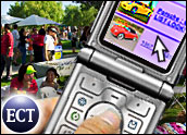
Cruising the Web on a smartphone is about like cruising for a date on a tricycle -- the basic concept is there, but the delivery is laughable. If you are using an iPhone, then it's more like cruising in a Volkswagen Beetle -- better, but still short of the Lamborghini speeds we're used to on the open cyber-highway.
Considering everyone -- from carriers and handset manufacturers to Web browser designers and search engines -- are racing to own the mobile Web space, why are mobile Web browsers still so lame?
Small Spaces
Part of the problem lies within the device landscape.
"It's incredibly challenging to create a desktop experience on a 2.5-inch screen," Philippe Winthrop, research director of wireless and mobility at the Aberdeen Group, told TechNewsWorld.
Consider it a problem with basic physics. "There is generally a 4-inch/7-inch question over screen size. Four-inch is the largest a screen can get and fit into a pocket and seven-inch is the smallest you can get to and still open up attachments in a rational way," Stuart Carlaw, wireless research director at ABI Research, told TechNewsWorld.
Even so, many are trying to squeeze the World Wide Web into a mobile mini dot-mobi.
Frankly, the thing may never fit. "I don't believe it's reasonable to expect desktop performance or ease of use on a mobile device," says Winthrop. "There's no way to compare a mobile device to a laptop or desktop with a screen that is at least 7 times bigger."
There's an even bigger problem behind the fallacy of a straight comparison. "We have to take into account that the computing power of a smartphone today is approximate to a PC in 1995. Web browsing then was a painful experience too," explains Carlaw.
Halfway Decent
The iPhone, with its sophisticated, over-sized touch screen and its savvy direct-to-Web-as-we-know-it browser, Safari, comes closest to the desktop experience.
To be completely fair, devices beyond the revered iPhone are making some headway. "Not all smartphone browsers are far worse than the iPhone," says Carlaw. "The Nokia N and E series actually do a half decent job."
Problem is, "half decent" is not anywhere near "good enough." So, what exactly is bogging down mobile browsers?
"While the competition in the space is fierce, mobile browser vendors still have to adhere to device manufacturers' specifications as well as carrier's constraints," Vidya Lakshmipathy, analyst in the customer experience group at Forrester Research, told TechNewsWorld.
Part of the iPhone's success lies in the fact that Safari doesn't have these problems. "Safari has been able to work around many of these problems because it's a version of a desktop browser intended for one device, the iPhone. Both are developed by the same company and closely partnered with their carrier, AT&T," explains Lakshmipathy.
There's a little more to it, though, than a carrier-device-browser marriage made in heaven. "The iPhone incorporated a large screen, some of the best touch screen technology, accelerometers, and a ground-up Web browsing design to realize the Web browsing experience from the word go," says Carlaw.
It's also packing some serious hardware advantage. "The iPhone also has considerably more memory than any other mobile devices so the browser definitely has an improved hardware platform to work from," adds Lakshmipathy.
Data Drip
Still, the iPhone has enough problems to keep it from the winner's circle. "There is still a need for a qwerty keypad. One big issue with the iPhone is that it doesn't do text entry too well," says Carlaw. It's hard to do much on the Web without relying heavily on text entry.
Many users also complain that the AT&T connection is much too slow. However, the iPhone isn't the only device hampered by carrier speed. "There are obviously a number of different mobile browsers out there, including Pocket IE, Opera, Nokia, BlackBerry, etc. They each have their pros and cons, but will all be limited by the speeds of the carrier networks," says Winthrop.
While user expectations are high, and constantly fanned by carriers eager for the extra revenue, the reality is a real drag by comparison.
"Slow data rates limit the browsers' ability to offer richer mobile experiences at speeds that users have come to expect from their desktops," says Lakshmipathy. "Compare the iPhone when used on a wireless broadband network to the cellular network -- the speed is so slow that site owners are finding that iPhone users continue to visit their mobile site because it is generally smaller and faster to load than their desktop sites."
In other words, slow-mo is a no-go even for iPhone users.
Turning the Tables
It doesn't help that the painful experience of mobile browsing comes at a greater cost. "The cost of data plans for most users still exceeds what they are willing to pay on top of their monthly phone bill for a marginal experience on the mobile Web -- particularly when not many sites have yet found the optimal content and function for mobile users," says Lakshmipathy.
Resolving the cost issue in order to speed mobile browsing is a bigger problem than most would think. "Carriers are in a Catch-22. If they price the service too low, it will stimulate traffic and they will be forced into huge network investments in order to support that traffic on current technologies," explains Carlaw. "Priced too high, and adoption rates will drop."
"More advanced technologies will allow carriers to support services on more spectrally efficient solutions thus allowing them to the drive the cost of services down," adds Carlaw. "W-CDMA (Wideband Code Division Multiple Access) is one step, but I suspect the full mobile broadband experience will only come with the widespread adoption of LTE (Long Term Evolution), WiMax and UMB (ultra mobile broadband)."
From Weak to Wonderful
This year, 115 million smartphones will be shipped, and that number will rise to 410 million by 2012, according to ABI Research. That's either a boon for mobile Web players or a backdrop for a user uprising, depending on what ultimately happens with mobile Web browsers.
Thankfully, there is evidence that the frustration will evaporate as mobile Web browsers eventually move from lame to luster. However, they can only do so when all the pieces fall in place.
"When 400+ Mhz and 128+ MB RAM becomes the norm on mobile devices, software vendors will be able to do more, regardless of screen limitations," says Winthrop. "By that point, 3G will be even more readily available (as will some early forms of 4G) that will provide greater parity to desktop performance."
The massive movement towards convergence will also lend a hand. "High speed browsers, larger screens, and commonly good touchscreen technology will probably all converge in the emergence of a new device type that sits between the smartphone and the ultra mobile PC which will emerge due to the opportunities offered by the move to 4G technologies such as WiMax, LTE and UMB," predicts Carlaw.
Once the technologies come to be, content will become a bigger issue.
"In order to reduce development time and cost of mobile sites, browsers need to be standardized and improved," says Lakshmipathy. "This would mean limiting the changes both carriers and device manufacturers can make to the browser itself."
"Finally, it will require users to demand a better experience from site owners and device manufacturers. Unfortunately, it will take time before this trickles down to browser developers because -- unlike on the desktop, where users can and do choose to use other browsers that they can download and configure -- users cannot do the same on their mobile phone, with the exception of Opera Mini," adds Lakshmipathy.
After all is said and done, and all the pieces pulled together, the costs knocked down and the dot-mobi's all lined up, then will we have a same and seamless experience on our nifty new totally converged smartphones?
"It's an apples-to-oranges comparison," says Winthrop. "I don't think it's reasonable to ever expect true parity with a desktop/laptop."
This story was originally published on Sept. 12, 2007, and is brought to you today as part of our Best of ECT News series.


 Loading ...


I don’t own an expensive smartphone. Like most people, I use a regular cell phone with cheap unlimited data plan. The best mobile-friendly portal by far is a1r.mobi (for guys) and a1r.mobi/me (for women). Both offer news, information, entertainment, live chat, forums, and 411. From either site, you can easily get to everything you want – fast, and everything is mobile-friendly. Plus, unlike my company workstation, I can take my mobile phone on breaks to read my personal e-mail or top news stories without company snooping. Most people with web-enabled cell phones don’t use the feature because they don’t know how (or that it even exists), or think it may be too expensive (check your carrier plans). The main reason I didn’t use my mobile phone at first was it was too much of a pain to find truly mobile-friendly sites. Most sites took too long to load, looked crappy when they did load, and often just froze. http://a1r.mobi is way different. Try it out on your own cell phone and see for yourself. Like me, you may decide you don’t need to trade up to a smartphone to enjoy web browsing. If you do own an iPhone or other smartphone, it’s great for you too!